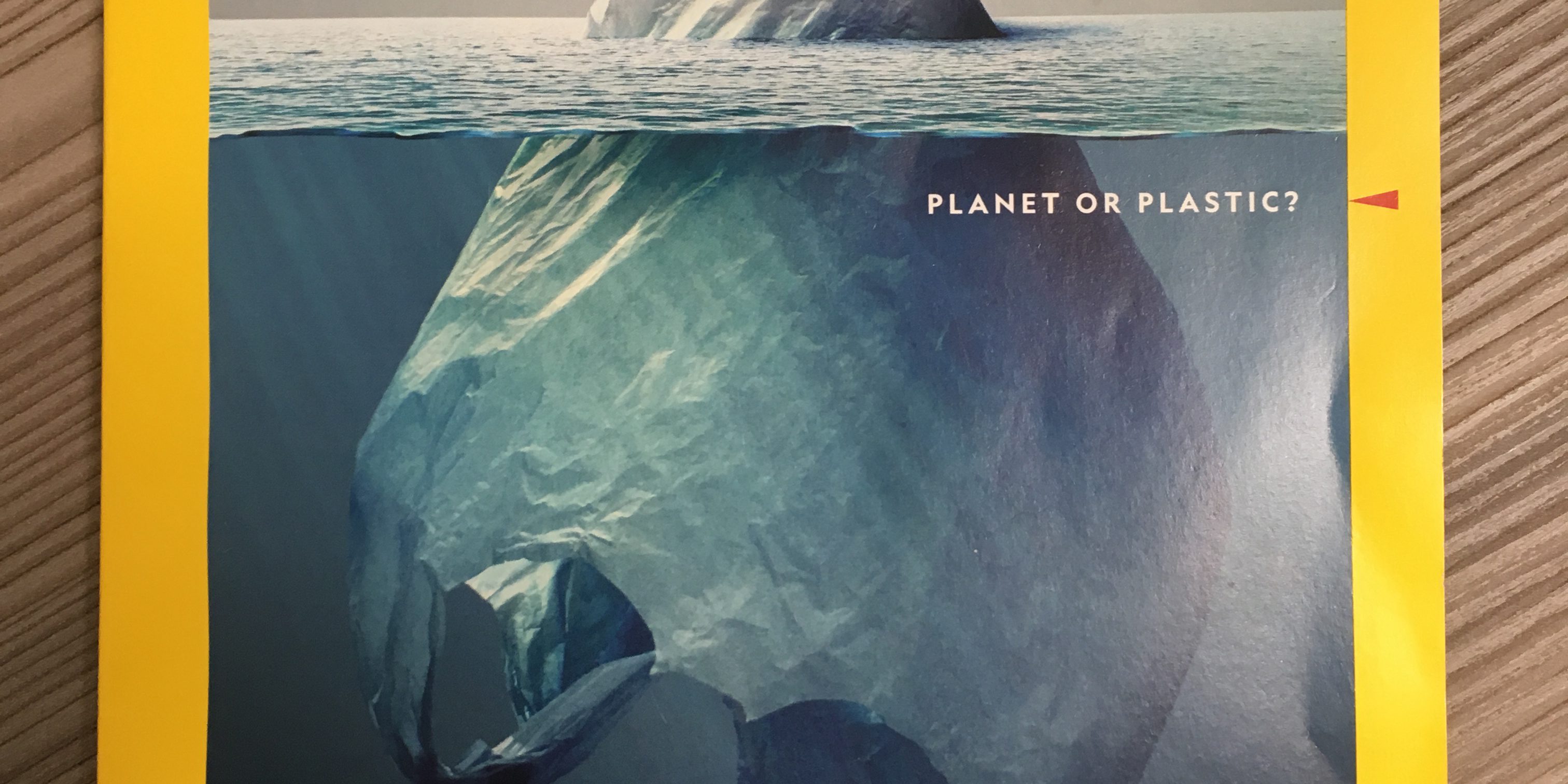
A picture is worth a thousand words, and this is one of the finest. The common grocery bag, upended and floating in the water looks every bit the iceberg it was intended to emulate. And the meaning is not lost either, the problem with plastic waste is huge, and this bag is only part of the problem—the “tip of the iceberg” as the caption reads.
This cover image is one of the best conceptual statements I have seen in a long time. When the message and the image come together so eloquently it is the best that graphic design can offer. Kudos to the photo illustrator, Jorge Gamboa. An image like this is profound. It practically tells the story by itself. And a skim through the article tells us that 9 million tons of plastic end up in the ocean each year. It’s astonishing and heartbreaking. It’s made me recommit to changing my habits.
And that’s really the goal of visual communication: to influence behavior, convey a message, and to do so in a memorable and immediate way. This image does it all.


